Cambridge Dictionary
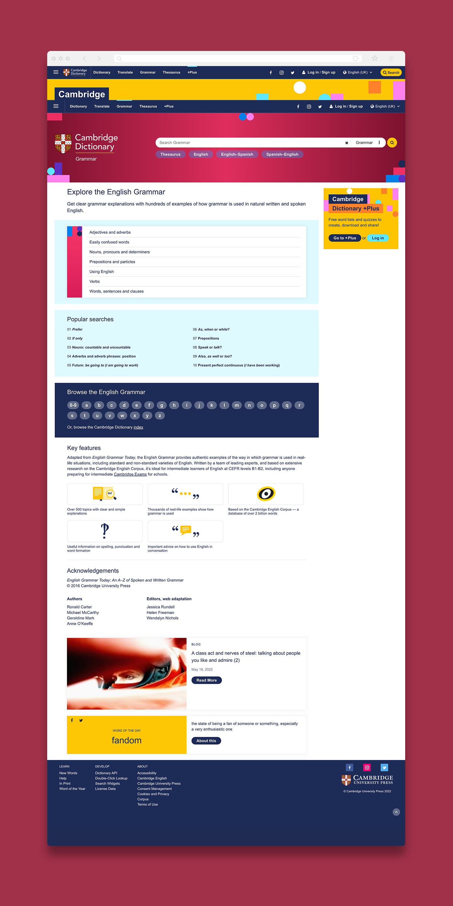
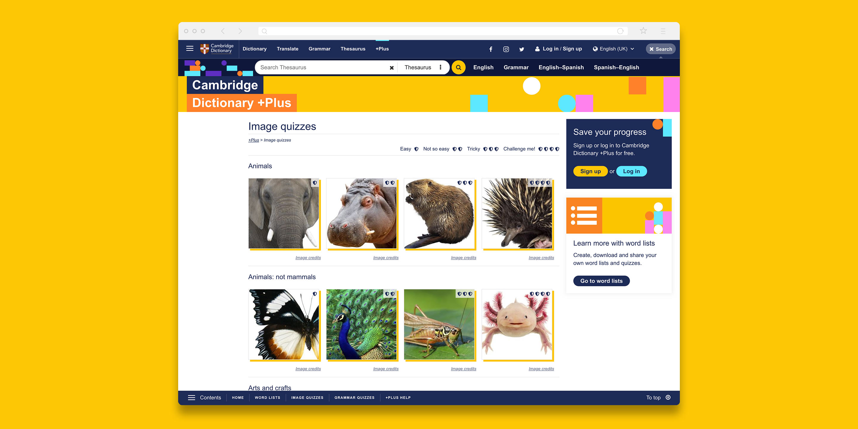
A UX upgrade and full redesign for the world’s largest online learner dictionary to meet rigorous standards
Brief
To fully redesign the Cambridge Dictionary website, improve user experience for learners, meet performance metrics, maintain advertising prominence and adhere to accessibility standards.
Idea
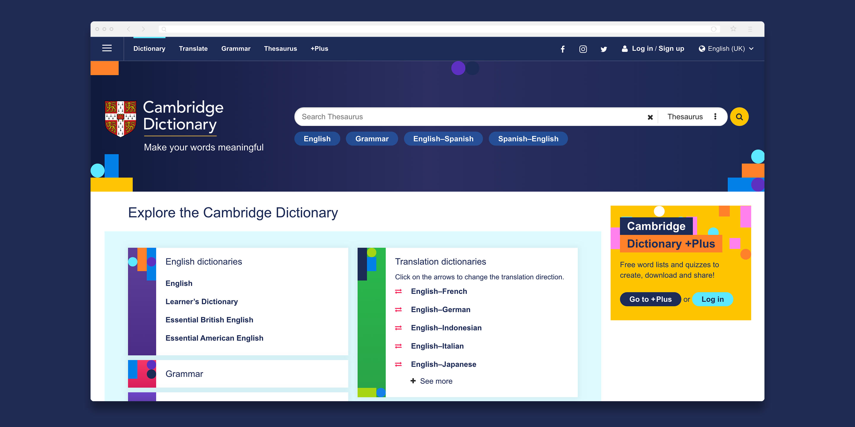
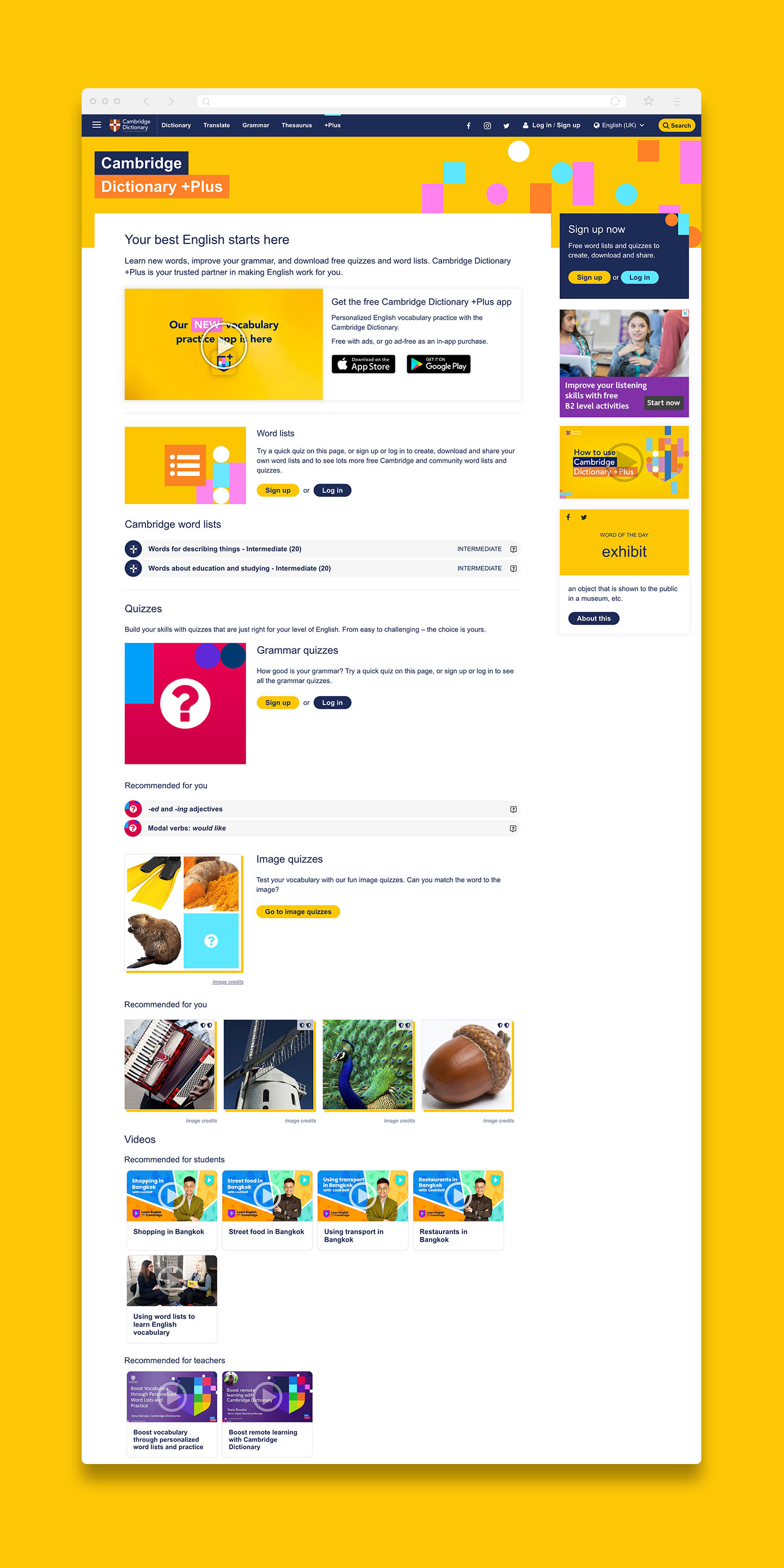
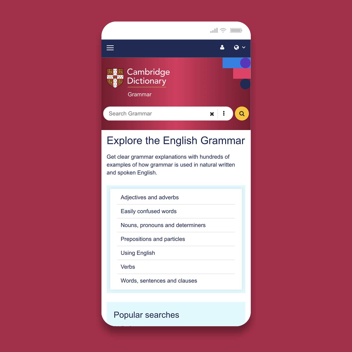
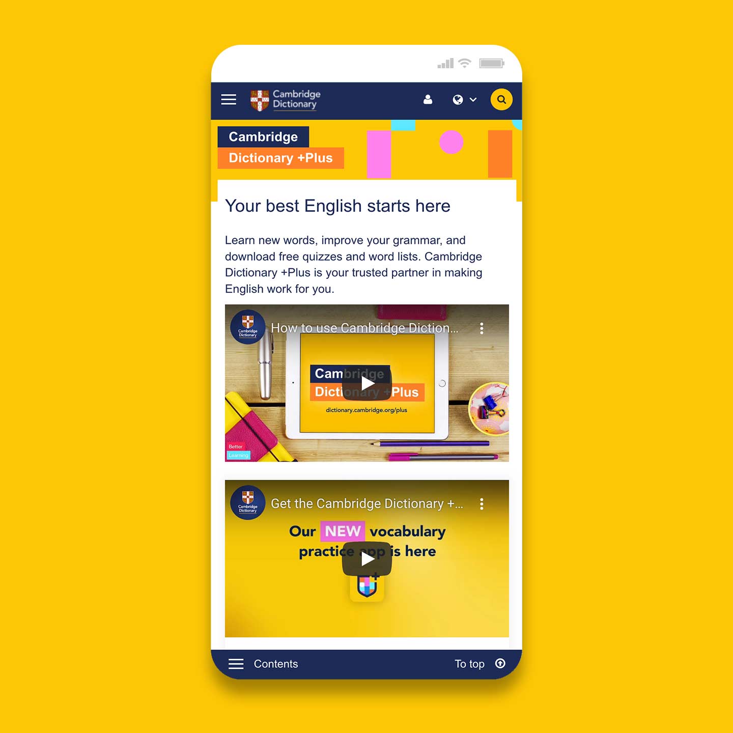
A complete visual redesign which removed dated images and replaced them with colourful streamlined shapes; designing a new navigation system of top, bottom and mobile friendly menus; redesigning entry definition pages and producing fully optimised front-end code for the UI.
Result
82% of the Cambridge Dictionary website users found the new design more visually appealing with the rate of account sign-ups increasing by 40%.
View site
