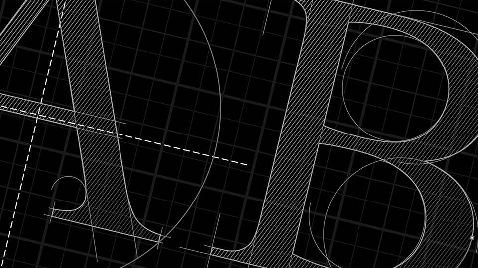
What's in a font?
01 March, 2023 Reading: 3:31 mins
Most people have an opinion on their favourite colours but not many have opinions on fonts and typography, or realise they make just as much - or arguably more - impact as the colour palettes they use. Here are five fabulous font facts and thoughts.

Do you know your fonts from your typesetting? Simply put, a font is the suite of letters used - your ‘alphabet’ - and typesetting is the way that’s arranged: think the distance between letters, lines, whether lines are used, how spaces are introduced and sizes used. It’s always important to consider the power of the right font used, in the right way, for the right project.
- Deep personal preferences.
Do you have a favourite pair of shoes, or a favourite song? Would you be able to say exactly why it’s your favourite? Most people can’t, and that’s okay! It’s one of the great things that makes us all unique. It’s no different with fonts - if you’ve got a font that just makes your eyes happy, but you can’t say why, then that’s the power of fonts working their magic! - Powerful design tool.
Fonts are phenomenal tools in any designer’s portfolio. They can be subtle and effective, eye-catching, humorous, but if you get the wrong fit then it can look downright ‘wrong’. Just as much as the font used, the way it’s laid out and typeset is make or break. But there are no hard and fast rules and in fact a creative break of rules can sometimes make a splash. Fonts act like images, giving an immediate impression of the content within, seconds before the first word has even been read. - Technical wizardry.
Designing an entire font and all the decisions that go into it is super technical and yet it looks effortless once it gets to the stage of being typeset. If you want to dive into the technical details and wizardry behind fonts, the episode of ‘Abstract’ on Netflix with Jonathan Hoefler, of Apple computer font design fame, is well worth a watch. - Variety.
There is so much variety when using fonts, and sometimes little rhyme or reason for why they evolve or otherwise. Entire genres of fonts can all be different in their evolution or recognition. Take the ‘circus’ family of fonts - you’d know it when you see it, and yet it’s remained unchanged for years; used to bring a sense of whimsy, magic and fun to signs, invitations and posters everywhere. On the flip side, Old English or calligraphic fonts are the clear origins of our modern-day favourites like Helvetica or Times New Roman. - Trends.
Font trends come and go, and pros can easily tell which decade they were introduced. The current trend is that fonts are getting simpler and simpler - is this so we can read them faster in our 24/7 ‘always on' world? Logos go through style trends and one of the ways we can see this play out is in the font - have you noticed all the ‘big brands’ opting for near-identical sans-serif fonts recently? This brings up the age-old debate: when does the design matter more, or less, than the word itself? Choosing an uncomplicated font is a critical design decision - just as much as choosing to design and use an ornate logo. Brands often want to look up to date and modern in their styling, so trends ripple through brand visuals too.
There’s always been a complicated and inextricable interrelationship between font and brand recognition - and over the lifetime of a brand the relationship between the two will wax and wane. A great example of a brand that has remained remarkably consistent is Disney with their ubiquitous font. Would switching their unique font to sans serif typeface work for them? There’s no right or wrong answer, just food for thought…
If fonts get you excited, or you’d like to refresh the way your brand looks, that’s something we love working on at KISS. Get in touch for a chat about how we can help you and check out some of our brand work!